Revamping Navigation with A Data-Driven Approach
Revamping Navigation with A Data-Driven Approach
Revamping Navigation with A Data-Driven Approach
This case study outlines the process of transforming a search-dependent user journey into an intuitive, insight-driven navigation system. By combining quantitative analysis with thoughtful UX strategy, the redesign improved usability, engagement, and business alignment.
Company
Nalli
Role
UI/UXR Intern
Industry
Retail
Year
2023
Overview
As a 95-year-old heritage brand, Nalli Silks recognized the need to establish a stronger online presence. Despite their rich legacy in traditional Indian textiles, they were losing ground to competitors who had better digital presence. I joined as their UI & UXR intern to help bridge this gap through research-backed design improvements.
The Problem
Nalli Silks faced a significant challenge: their website wasn't effectively serving customers who wanted to explore their extensive collection of traditional Indian garments. While they had a strong physical retail presence, their online experience wasn't meeting user expectations or business goals.
Key Issues Identified:
Users struggled to find specific products through navigation
The site structure didn't reflect actual user behavior patterns
Strong competitors were dominating the online silk and saree market
The website didn't effectively showcase Nalli's heritage and quality
Business Goals:
Increase online engagement and conversions
Improve user experience to match offline brand reputation
Compete more effectively with established e-commerce players
Maintain brand heritage while modernizing the digital experience
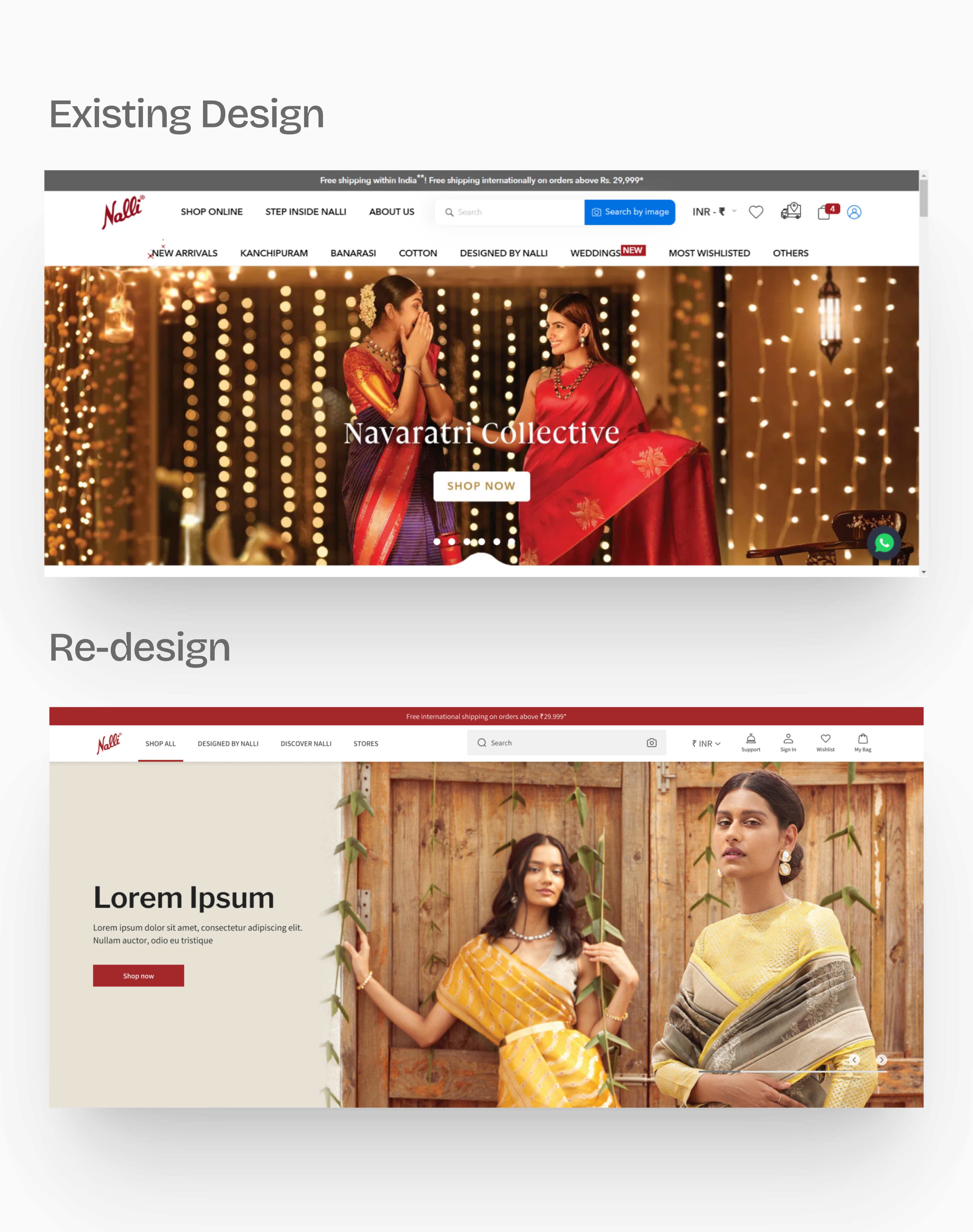
Status Quo
Before the redesign, users struggled to find products through the main menu, with most relying on the search bar. The navigation did not reflect customers’ shopping behaviors or the brand’s most popular categories, creating friction in the online experience.
90% search dependency - Users heavily relied on search function rather than browsing categories
Poor navigation structure that confused users and hindered product discovery
Misaligned information architecture that didn't match user mental models
Strong offline presence but weak digital competitive positioning
No data-driven insights informing previous design decisions
Limited understanding of actual user behavior patterns on the website
The Problem
Nalli Silks faced a significant challenge: their website wasn't effectively serving customers who wanted to explore their extensive collection of traditional Indian garments. While they had a strong physical retail presence, their online experience wasn't meeting user expectations or business goals.
Key Issues Identified:
Users struggled to find specific products through navigation
The site structure didn't reflect actual user behavior patterns
Strong competitors were dominating the online silk and saree market
The website didn't effectively showcase Nalli's heritage and quality
Business Goals:
Increase online engagement and conversions
Improve user experience to match offline brand reputation
Compete more effectively with established e-commerce players
Maintain brand heritage while modernizing the digital experience
Status Quo
Before the redesign, users struggled to find products through the main menu, with most relying on the search bar. The navigation did not reflect customers’ shopping behaviors or the brand’s most popular categories, creating friction in the online experience.
90% search dependency - Users heavily relied on search function rather than browsing categories
Poor navigation structure that confused users and hindered product discovery
Misaligned information architecture that didn't match user mental models
Strong offline presence but weak digital competitive positioning
No data-driven insights informing previous design decisions
Limited understanding of actual user behavior patterns on the website
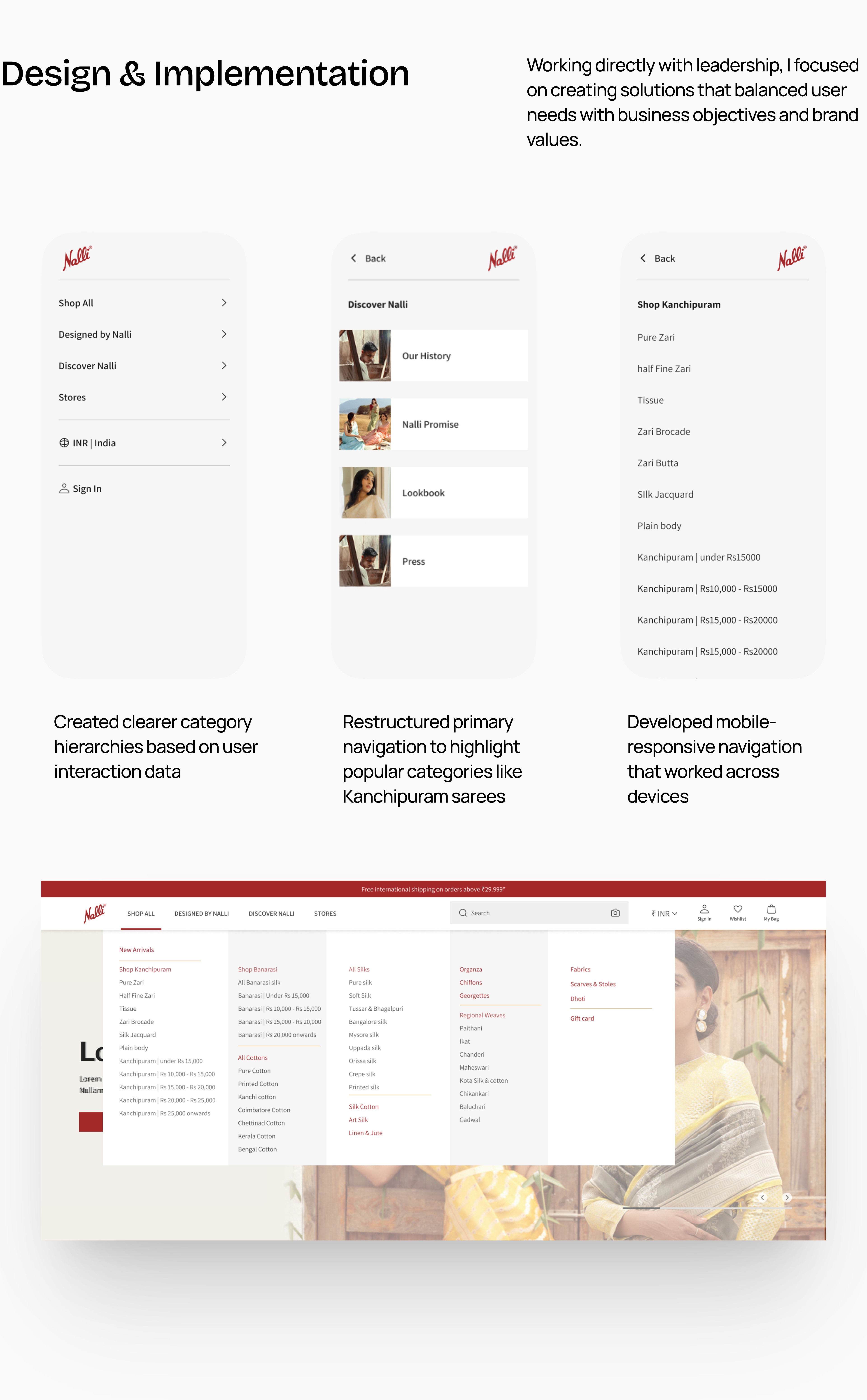
Research & Analysis
Working as the sole designer, I took a methodical approach to understand user behavior through data analysis. Using Microsoft Clarity and Google Analytics, I spent several weeks diving deep into how people actually used the existing website.

Process & Approach
Based on the research findings, I developed a systematic approach to redesigning the navigation:
Phase 1: Data Compilation
Created comprehensive Excel sheets mapping user interactions, popular categories, and search patterns to identify priority areas for improvement.
Phase 2: Information Architecture Review
Analyzed the gap between current site structure and actual user behavior to propose a more intuitive organization.
Phase 3: Design Solutions
Developed multiple navigation options that prioritized high-traffic categories and made search more prominent.
Phase 4: Stakeholder Collaboration
Presented findings and design recommendations to the Vice Chairman and Marketing Head, incorporating their business insights and brand considerations.
Research & Analysis
Working as the sole designer, I took a methodical approach to understand user behavior through data analysis. Using Microsoft Clarity and Google Analytics, I spent several weeks diving deep into how people actually used the existing website.
Process & Approach
Based on the research findings, I developed a systematic approach to redesigning the navigation:
Phase 1: Data Compilation
Created comprehensive Excel sheets mapping user interactions, popular categories, and search patterns to identify priority areas for improvement.
Phase 2: Information Architecture Review
Analyzed the gap between current site structure and actual user behavior to propose a more intuitive organization.
Phase 3: Design Solutions
Developed multiple navigation options that prioritized high-traffic categories and made search more prominent.
Phase 4: Stakeholder Collaboration
Presented findings and design recommendations to the Vice Chairman and Marketing Head, incorporating their business insights and brand considerations.
Outcomes & Impact
The redesigned navigation showed measurable improvements in user behavior:
Quantified Results:
Reduced search dependency from 90% to 60%
Increased category browsing by 40%
Improved user engagement metrics across key product pages
Better alignment between user behavior and site structure
Key Learnings
During this project, I gained a lot of hands-on technical skills. I learned how to use web analytics tools like Google Analytics and Microsoft Clarity more confidently, and I became comfortable reading and interpreting heat maps to spot where users were getting stuck. Using real data to make design decisions was a new experience for me and really helped me see the impact of small changes. I also got to think about how the website worked across different devices, making sure users had a good experience whether they were on a phone or a computer.
On the cultural side, I saw how important it is to know the background and values of the brand when designing for e-commerce. Traditional businesses have their own way of thinking about going digital, and I learned how to respect those traditions while still suggesting fresh ideas. Finding a way to honor the brand’s heritage while making things easier for modern users was an important part of the work.
Reflections & Next Steps
This project reinforced my belief in the power of data-driven design and showed me how impactful good UX research can be for traditional businesses entering the digital space.
Conduct user interviews alongside the analytics data
Create more detailed user personas based on the behavioral patterns
Implement A/B testing for the different navigation options